
P O M E G R A N A T E
ABOUT:
ABOUT:
The first project that I've created is focused on the object of one of my favourite fruit - pomegranate, but I have chosen it not only beacause of the fact that I really like it but also the structure of it on the inside and on the outside is so different from popular fruit such as apples. The project is about developing the fruit of pomegranate and presenting it in different ways, using various techniques.
FIRST PAGE:
I decided to use watercolours to create this bit as they are my favourite paints and also I think that they really match the main subject in here. I really like the way how you can create layers and so many colours that are exactly the same as the pomegranate ones. Even though my letters are not 100% straight, I think their style matches the whole idea of this 'main page'.
SECOND PAGE:
"The whole idea behind 'project pomegranate' is to develop on how to find different structures and methods to present sych a fruit as pomegranate, obviously. Whilst working on this project I found out that if you are focused enough on your work, it's very easy to get inspired and come up with new ideas to exhibit object of your choice."
THIRD PAGE:
>mixed media
"Pomegranate has always reminded me of a normal grenade. Maybe it's because of the fact that there's one word in polish to name both of them. So I simply decided to combine them into one using the mixed media technique."
>b&w (pieces of black paper and white poster paint)
"focusing on insides of pomegranates and discovering new structures and patterns"
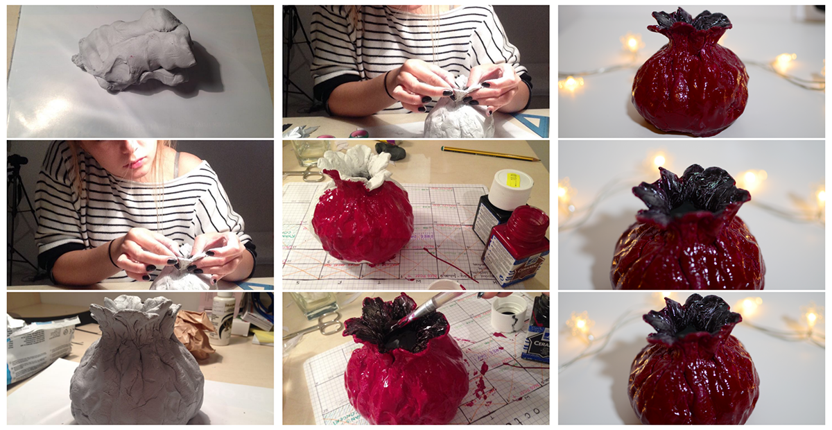
SCULPTURE
Then I decided to create something different than just drawings/sketches/mixed media things in my sketchbook. I wanted something bigger, to develop the pomegranate even more. That's why I decided to give it a go and create a sculpture that would remind me of a chosen fruit bul also a vase. In the pictures you can see the whole process of creating it.
SUMMARY:
It's pretty much important to stop for a minute and think - what this little project gave me? What I've learnt and enjoyed?
It gave me a lot. Especially because of the fact that it was the very first part of my portfolio that I was working on. Before starting it, I've done a lot of thinking, I wanted to do something different, to surprise myself with the final result and to be honest I absolutely did. Some pieces were easier, other bits and bobs were a bit more tough but in the end I need to admit that it left me with this sparkle somewhere deep inside and a thought that the whole portfolio thing doesn't have to be a stressful part of applying to uni. I have to enjoy it and do what makes me feel excited,motivated and inspired. So what I learnt is: be brave with your work, express yourself as much as possible and let every little thought that you have in your head turn into a piece of your project, a piece of your work. Whenever you fully like it or not, whenever you think you're talented in this path or not. Just do what your heart tells you to do.

G E O M E T R Y
ABOUT:
As much as I hate algebra, I love everything connected to geometry. I aslo think that it's pretty important in the work of interior architect, isn't it? So I decided to play a bit with it, give it a go, use and show it in different ways, at various levels. Look for geometry in every day life situations, places, buildings, how to put it all up to make it look presentable (at least in my mind) and think about different perspectives, ideas and simply stay inspired.
NEXT PART:
The next three pages are origami inspired, same as doing origami it was quite time taking and needed a lot of precision and focus to be made.

ABOUT THE PROCESS:
I haven't chosen the easies way to create these three pages. Firstly I drew animals on each page, but left a blank one underneath, then on the blank one I decided to glue some pieces of magazines to match the animal that is going to be represented by these colours, afterwards I cut out those triangles and other shapes and glued one page to another. The worst part was probably cutting out those pieces, because of the fact that I decided to do it in my sketchbook and if something would go wrong - the whole thing would be ruined. In the end everything turned out as planned (besides two tiny lines that got ripped while I was cutting out these shapes, but I am very happy with it.
I haven't chosen the easies way to create these three pages. Firstly I drew animals on each page, but left a blank one underneath, then on the blank one I decided to glue some pieces of magazines to match the animal that is going to be represented by these colours, afterwards I cut out those triangles and other shapes and glued one page to another. The worst part was probably cutting out those pieces, because of the fact that I decided to do it in my sketchbook and if something would go wrong - the whole thing would be ruined. In the end everything turned out as planned (besides two tiny lines that got ripped while I was cutting out these shapes, but I am very happy with it.

FIRST PAGE:
It's easy to find any geometrical connecion, even on humans bodies. When it comes to this piece I need to admit that I'm proud of it, as I've always struugled with drawing/sketching people, especially hands. I think this one doesn't look that bad.
"imagine that those purple lines
are like s t r i n g s
that help us move our fingers,
muscule, tendons, hands,
they let us bend and straighten the fingers,
catch something, play instruments, work, paint,
hold, create, help, draw, squeeze something,
put something down,
or leave it forever"
SECOND PAGE:
"Bambi" characters surrounded by geometrical shapes.
It's like the modern, weird, different version of Bambi and his friends. I was inspired by some pictures that I've seen on tumblr with squares and triangles that were put on plants. I haven't even saved them on my computer/phone. The idea crossed my mind whilst I was working on this project, that's why I decided to put it in a different way than the one I've seen earlier.
It's like the modern, weird, different version of Bambi and his friends. I was inspired by some pictures that I've seen on tumblr with squares and triangles that were put on plants. I haven't even saved them on my computer/phone. The idea crossed my mind whilst I was working on this project, that's why I decided to put it in a different way than the one I've seen earlier.
THIRD & FOURTH PAGE:
Things we need to remember about when it comes to geometry and building objects. A reminder from my last year extracurricular architecture sketching classes. Got to admit that sketching elipses is my Achilles' heel, that's the thing I need to work on a bit more.

CRYSTALS: "In a crystal we have the evidence of the existence of a formative life principle, and though we cannot understand the life of a crystal, it is none the less a living being." - Nikola Tesla
WHY CRYSTALS?
Well, this is pretty much easy. They just SCREAM geometry to me. All of their anfles and simply - shapes are oh-so matching to the name of this project. I couldn't resist. I just love different kinds of crystals."
The funny thing is that I've chosen the colours to this piece couple of weeks before they became the colours of S/S2016.
Anyways - as I said above, I really love crystals, some of them are fragile, others are strong. But all of them are incredibly beautiful.
AND THEN... suddenly... I came up with an idea of creating something like this sculpture above.
To be honest at first I had no clue on how to end up this project, but I knew that I need a final piece, I want a final piece. The other day I've woken up and instantly came up with an idea of creating a 3D crystal out of a copper wire, not only because of the fact that copper things are very popular at the minute but also because it seemed to match the whole thing. I was more wrong than ever. It was horrible to work with, way too flexible. I was absolutely heartbroken, but decided not to give up and try to find the best solution. I resolved the problem with gluing wires to a piece of paper and then one wire to another as you can see on the pictures above. In the end it looks barely perfect, the only drawback is the fact that glue is visible in some angles, but I decided not to recreate it again, but to work with what I have had from the very beggining. Am very proud of myself after all of these 'fights' with the wire and also like the final piece.
SUMMARY:
It was a very diverse project, even though it was based on the geometry, as you could have seen, I presented the main subject in various ways. At some points I was extremly nervous (especially with the sculpture/3d model thing when it wasn't working out in the way I expected it to). To sum it up - I've learnt a lot again, done something that I enjoyed and learnt that we shouldn't give up on any piece of our work. If you start doing something - you have to end up doing it, because the final version might be surprising. Also technicaly, I learnt on how to work with the wire and how to put/find geometry in different situations/pieces.

D I S N E Y
ABOUT: I'd describe myself, partly obviously, as a Disney freak, I love everything that is connected to fims by Walt Disney Pictures. As I started working on my portfolio I knew that one project has to be based on Disney. This one, besides representing four Disney films is also going to show four seasons and present four places/buildings in specific season. In the end I'm going to make a mockup out of this. More information below.
TANGLED: I decided to choose Tangled as one of four disney films for this project, Rapunzel and her friendly cameleon are one of my faves and their towe couldn't be missed in this mockup you're about to see in three more drawings/pages. Tangled is going to represent spring over there.
FROZEN: As the project is going to represent not only Disney but also four seasons I couldn't miss Frozen (for the winter part obviously). The storyline to this film is really beautiful and touching to be honest. Besides that it's incredibly inspiring due to interiors and exteriors we're able to see while watching it. My favourite is Elsas ics castle, it looks so delicate and strong at the same time. Very nice one.

FAIRIES: Another film that I absolutely adore. Fairies is going to represent autumn. Why? It's easy, the first time I've seen this one was somewhere durning autumn. I can remember myself and my sister sitting under the blanket, watching it on Disny Channel. I loved it and that's why it's a part og it! (Also there is one part of Tinkerbell and her friends adventures durning autumn time).
LILO & STITCH: Lilo and Stitch is my all time favourite Disney film that have ever been created on this planet Earth. The storyline is very close to my heart and simply means a lot to me. When it comes to the project - I knew I couldn't miss it, it was actually the film that I've chosen as the first one. Lilo and Stitch is going to represent summer as it's all about surfing and developing the island whilst Stitch is trying to find himself.
ABOUT MOCKUP IDEA (before even starting it): Everything has to be made out of cardboard as I own a huge cardbord box and am finally going to use it; I won't paint it fully, just around one/two colours on one season as it's going to be just a symbol, not a recreation of a building/place + I'm not sure about the cardboard bit, it might be a tricky material to work with but am going to give it a go! + no character included, only exteriors/places + spring (green, purple), winter (blue, white), autumn (orange, brown), summer (yellow, red)

PROCESS:
As I guessed - cardboard was a tricky material to work with, so whilst working on this mockup I changed my plan a tiny bit, decided to make it as a mixed media thing, as it seemed to work better this way and I wasn't wrong, not this time. I also decided to add more colours than just two of them, but still - I tried to mostly use ones I've choosen before even starting it.
The most suprising bit in here was using millet as sand on the beach. The rest of the process is visible on the pictures.

SUMMARY:
The final piece is something what I really dreamed of, like the way how it turned out in the end. The only thing that I'd probably change/do differently if I create it once again is the hight and width of the tree, it's a tiny bit too big, but not that big and disturbing. Got to admit that I adore the final result. This is also my third project and the last big one for this portfolio. The next bits and pieces are samples of my sketchbook, filming/editing skills and photography.
The final piece is something what I really dreamed of, like the way how it turned out in the end. The only thing that I'd probably change/do differently if I create it once again is the hight and width of the tree, it's a tiny bit too big, but not that big and disturbing. Got to admit that I adore the final result. This is also my third project and the last big one for this portfolio. The next bits and pieces are samples of my sketchbook, filming/editing skills and photography.

SAMPLES OF MY SKETCHBOOK:
I tend not to only sketch in my sketchbook, for me it's a place where I can put everything that inspires me, where I can leave some thoughts, ideas, projects, where I can write/put pics of my favourite interiors and more.
I tend not to only sketch in my sketchbook, for me it's a place where I can put everything that inspires me, where I can leave some thoughts, ideas, projects, where I can write/put pics of my favourite interiors and more.

SAMPLES OF MY PHOTOGRAPHY:
What's my story? One day by accident and boredom I grabbed a camera of my uncles, went outside, took couple of nature shots. I was around thirteen then. Photography instantly became one of my hobbies. I fell in love with the idea of capturing a moment in your own way. Maybe I'm not the best photographer in the entire world, but I'm really passionate about it
I've got a special tumblr dedicated to my photos: http://photostakenbysan.tumblr.com
Above and below you can see samples of my photography.
Pictures above were taken on a Brick Lane in London, in November 2015.

'black swan and a white ghost'
pictures above were taken durning summer 2014
pictures above were taken durning summer 2014
pictures above were taken on different days in 2012/2013 when I was getting a bit better at photography and my interest was growing way more than before
SAMPLE OF MY FILMING/EDITING (youtube):
As I've written in my personal statement - I've got a youtube channel that I lead in English. Even though this video doesn't include me talking, it does include some shots and clips from Rhodes Island where I've been durning last summer holidays. Although I haven't been sure about which course I would like to choose by then, you can see that I mainly focused on interiors, details, exteriors and nature.
As I've written in my personal statement - I've got a youtube channel that I lead in English. Even though this video doesn't include me talking, it does include some shots and clips from Rhodes Island where I've been durning last summer holidays. Although I haven't been sure about which course I would like to choose by then, you can see that I mainly focused on interiors, details, exteriors and nature.


